


NASCAR Graphics Change for TV
February 16, 2022
I noticed in clips for the practice at Daytona, the graphics showing the leaderboard has changed.
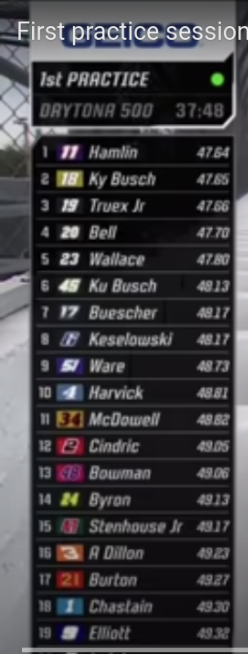 The old Graphics were pretty basic while the new one (above) shows things like the colors, number style, and a new font.
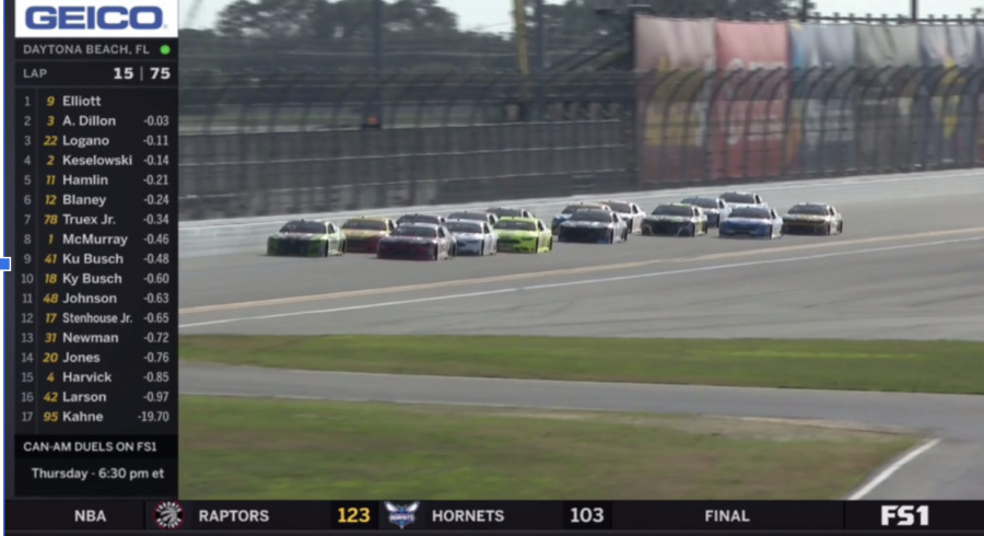
This here is the old graphics. See the difference? While the old one has colors and styles for numbers and fonts, the numbers are yellow and have a pretty boring font. The font for the names is also a pretty basic font with white coloring. One thing that is in common is that the top of the graphics has a sponsor. One thing that I liked about the old graphics was how it used to show a bar of other sports playing. This way you could see other sports playing, while you watched the race.
I hoped you liked this article about the graphics of NASCAR.